Use Textures for Colour Grading
Colour grading holds significance in transforming the mood and atmosphere of a photograph or artwork. It allows artists and photographers to enhance their visuals, evoke specific emotions, and create a cohesive aesthetic. While there are various methods for colour grading, one effective technique involves the use of Digital Textures in Adobe Photoshop.

Textures used: Soft green gradient for unity, a light grunge overlay to add vintage character, and a painterly wash for depth. These textures are from my Renaissance Collection.
Let’s explore why colour grading is crucial in the editing process and discuss how digital textures can elevate the results.
Establishing a Consistent Mood
Colour grading plays a pivotal role in establishing a consistent mood throughout an image or a series of images. By manipulating the colour tones, artists can create a distinct atmosphere that aligns with the intended narrative or artistic vision. Whether it's a warm and nostalgic feel, a cool and futuristic ambiance, or a vibrant and energetic mood, colour grading sets the tone for the entire composition. Digital textures serve as a valuable tool in this process, as they add depth and complexity to the colours, enhancing the overall mood. By applying textures such as film grain, scratches, or subtle overlays, artists can achieve a more organic and textured look, further immersing the viewer in the desired mood.
Enhanced Visual Appeal
Applying digital textures can make your images more visually engaging and captivating. Whether it's adding a vintage film grain, rough paper texture, or painterly effect, textures can infuse a sense of nostalgia or realism, making the image feel more authentic and interesting.
Colour Toning
Digital textures often come with their own colour information. By blending these textures with your image, you can introduce new colour tones and hues that complement or contrast the original colours, enhancing the overall colour grading effect.
Colour grading is a powerful part of the editing process — it helps artists and photographers enhance visual appeal, evoke emotion, and create a cohesive aesthetic. When combined with digital textures in Adobe Photoshop, it becomes even more impactful and expressive.
Digital textures allow you to set a consistent mood, strengthen your storytelling, and develop your own signature style. By weaving textures into your colour grading workflow, you can elevate your images, captivate your audience, and create work that truly leaves a lasting impression.

Here, warm and rich textures add depth to the water and background walls, creating a nostalgic, almost vintage feel.
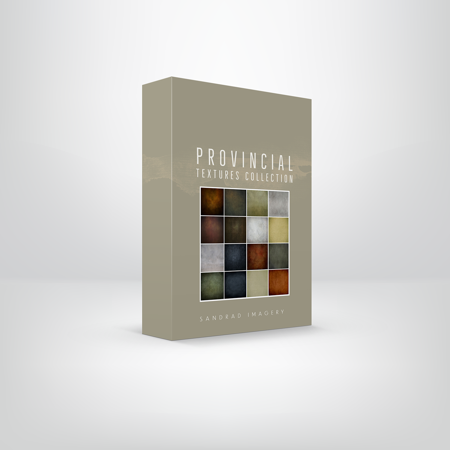
Textures used: Warm toning overlays, subtle scratches for an aged look, and tonal shading to emphasize mood from the Provincial Texture Collections
Atmosphere and Mood
Different textures can evoke specific atmospheres and moods. For example, using a subtle overlay of grunge texture can give a dark and edgy atmosphere, while using a light and airy texture can create a soft and dreamy mood. Combining these textures with colour grading techniques can reinforce the intended emotional impact of your image.
Consistency and Reproducibility
If you find a combination of colour grading and textures that works well for a specific style or project, you can save it as a preset or template. This way, you can easily apply the same grading and texturing to multiple images, ensuring consistency and efficiency in your workflow.
Recovering or Enhancing Details
Sometimes, an image might lack certain details or exhibit imperfections. By using textures creatively, you can strategically cover or enhance specific areas, providing a solution to hide flaws or draw attention to particular elements.
Enhancing Visual Storytelling

Textures unify the field and sky, adding gentle warmth and an aged, timeless quality to this whimsical childhood moment.
Textures used: Warm sky gradients, grain overlays for vintage softness, and tonal adjustments for cohesion.
Colours have the ability to evoke emotions and influence the way viewers interpret an image. Colour grading aids in enhancing visual storytelling by directing the viewer's attention and conveying specific messages. It helps guide the eye to important elements, highlight focal points, or create visual contrasts.
For example, desaturated and muted colours can evoke a sense of melancholy or nostalgia, while vibrant and saturated colours can evoke energy and excitement.
Digital textures offer an additional layer of creative control, allowing artists to add intricate patterns, overlays, or gradients that complement the colour grading.
This combination can significantly elevate the impact of the storytelling, making it more engaging and immersive.
Textures like light leaks, dust, or grunge overlays can add a sense of authenticity and visual interest, further enhancing the narrative elements within the image.
Creating a Signature Style

For this image I combined several digital textures to give depth and tonal range of colour, as well I added a texture overlay (clock) to add atmosphere and mood.
In the world of photography and digital art, establishing a unique style is essential for setting oneself apart. Colour grading serves as a powerful tool for artists to develop and showcase their signature aesthetic.
By applying consistent colour grading techniques across their body of work, artists can create a recognizable and cohesive visual identity. This style becomes synonymous with their brand or artistic persona.
Digital textures in Photoshop contribute to this process by enabling artists to experiment with different textures, overlays, and blending modes. This flexibility allows them to refine their personal style, adding a distinct touch that sets their work apart from others.
By incorporating textures that align with their artistic vision, artists can create a visual language that becomes their trademark.
Time-Saving & Inspiring
Using pre-made digital textures can save you valuable time compared to creating complex textures from scratch. They’re easy to apply, allowing you to experiment quickly and explore different moods and styles without overcomplicating your workflow.
Embrace the power of textures and watch your creative vision come to life in your colour grading process. If you'd like to dive deeper, you can explore my free texture tutorials — your unique style and immersive storytelling journey are just waiting to unfold.